01 — The Problem
An existing Swedish pick & mix candy brand had a website that didn't make browsing easy. The brand identity and product story were strong, but the structure got in the way of finding and choosing products.
A reimagined pick & mix candy brand site — cleaner UX, same brand identity
A reimagined interpretation of an existing Swedish pick & mix candy brand's website — rebuilt with a cleaner, more user-friendly browsing experience while preserving the brand's identity and product story.
View live product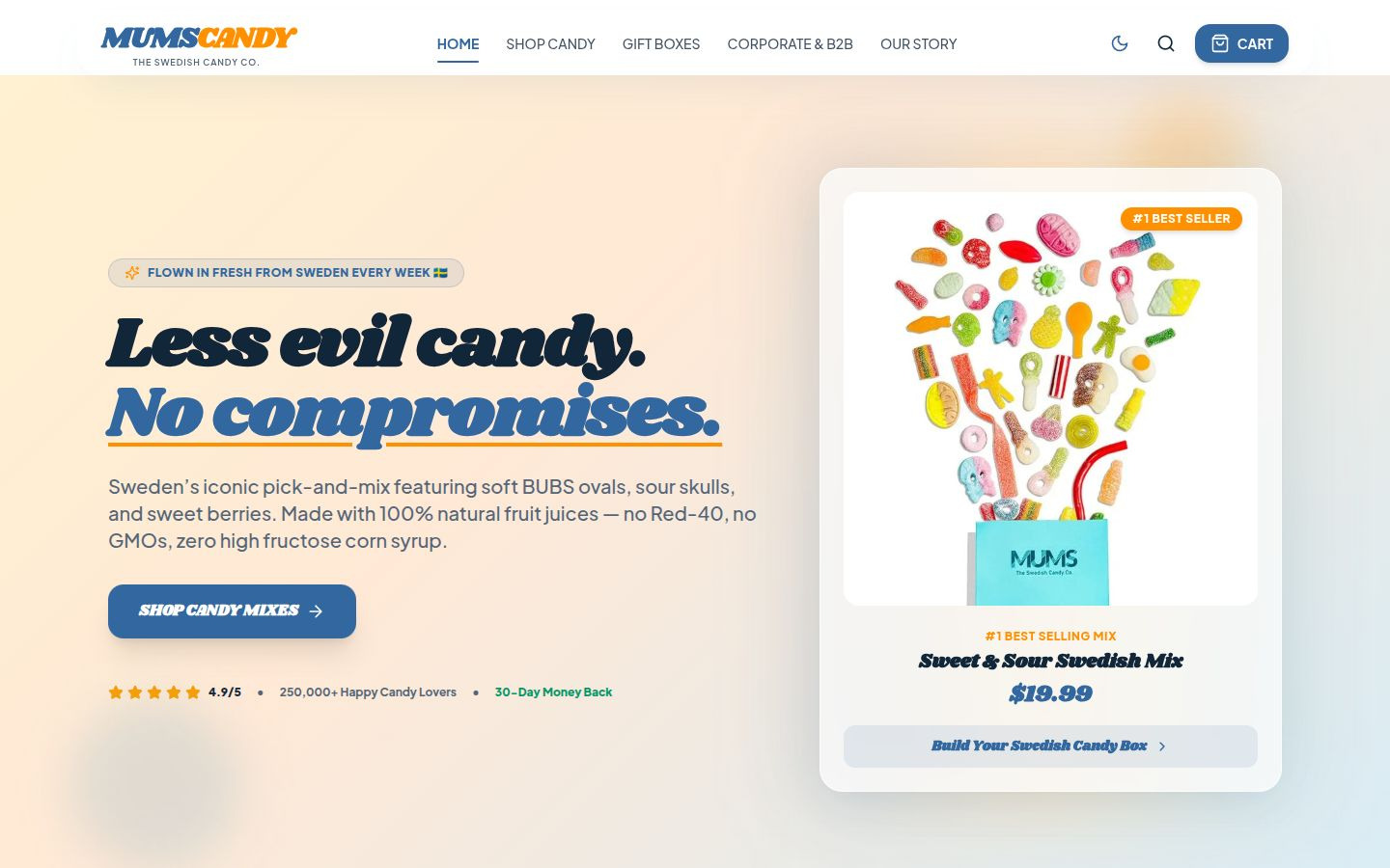
An existing Swedish pick & mix candy brand had a website that didn't make browsing easy. The brand identity and product story were strong, but the structure got in the way of finding and choosing products.
I treated this as a UX redesign, not a rebrand. The goal was to preserve the brand's identity and product story while rebuilding the site's structure for clarity and ease of use.
I redesigned the site's structure and UX for clarity and ease of use. Navigation, product discovery, and the browsing flow were reworked end-to-end.
The rebuilt structure keeps the brand's identity intact while making the pick & mix experience straightforward — find a product, understand it, and move through the site without friction.
Cleaner hierarchy, less noise, and a browsing flow that respects how people actually shop pick & mix candy. The brand still feels like itself — just easier to use.
A live, redesigned storefront that's easier to browse without losing the brand. No invented conversion numbers — the redesigned experience is the evidence.
I can build something tailored to your business and your customers.